The magical thing that goes on in Pixel's head.
or pixel's stupid ideas for the
new aglami website
Act 1 - Take 1:

Pixel/Reinder:

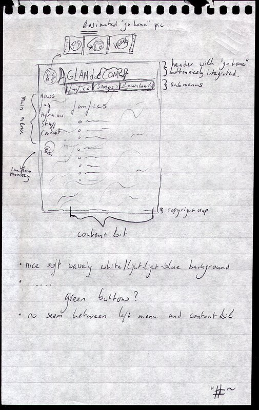
>>Comment on this please...
>>http://www.warande.net/~pixel/crap/aglami/take01.jpg
>
>What is wrong with frames?? I abhor sites that have to reload the menu again
>with every click.

If the menu is just mainly made of text which doesn't take long to
load, I think it looks a lot slicker as frames. With frames I often
feel like the left side menu is too obtrusively present...
(compare menus of www.biezenhutters.nl/lignum to
www.lukewhitmore.com/aglami)

>Also, I do not quite agree with the email addresses of the webmasters at the
>bottoms, I think it should be added to the "Contacts" menu.

Not even a general, all purpose email address? (that is what I meant,
not addresses to all the webmasters).
Just a lone single line at the bottom of each page saying:

"This website is copyrighted by the aglami community. Stealing of
stuff would not be nice.
general-info-something@aglami.com"

I always find that looking slick and gives out a clear message that
you have reached the bottom of the page. Like a page-number in a book.

>But I like the font! What is it called?

Har har. Very funny.

>Also, I agree with the general layout, though of course it is a bit basic.

Of course it's basic, I just made that in a few minutes, it's very
general idea about lay-out that all.

I liked what mixnmojo used to look like except that I don't like menus
on the right. So like the old mixnmojo before it went down minus the
right menu, with a more nice unionty of the menu and the main bit
graphic wise.
Act 1 - Take 2:

Pixel/Tracicle/Gaz/Reinder:

>>>Next (not really a 'next', but more a 'more'):
>>>http://www.warande.net/~pixel/crap/aglami/take02.jpg
>>
>>It's too polite.
>
>It's serene!

I think that it's too... paper-scan themed... maybe you can make it
work, but.. :-D

>>I am not sure what you have in mind with an "animated go-home" thing,
>>but I hope you do not mean some annoying gif that changes all the time?
>
>Something that changes into something that says home when you move
>your mouse over it

oh, okay, that is all right...

however, what is "home"? the news section?
Act 1 - Take 3:

Pixel/Reinder:

>>I think we all seem to about agree on the lay-out, but I agree with
>>Reinder on the submenu I think.
>>
>>A left menu on the left with only the five (or whatever) main menu
>>items, and then above the main content bit a menu with the submenu's
>>listed next to eachother.
>>Like this: http://www.warande.net/~pixel/crap/aglami/take03.jpg
>>
>>Only, what if there are to many submenu items for one line? Just a
>>second line with items? Like:
>>faq: - item, - item, - item, - item,
>>     - item, - item, - item,                  ?
>
>Well, if we set the site width to 750 pixels, 100 for the menu, then we
>still have 650 for the submenu width. If we use a small font size
>and/or graphics, it should be feasible to fit it on one line. I mean, we
>don't have endless lists of subitems. Not yet at least.
>But imagine we do, then just a second line seems fine to me...

Oh, I was going to say something here, but I misread the thing about
the width. Never mind. Good. Move on. 750 complete width is good.
Act 2 - Take 1:

Gaz/Kasper/Pixel:

>>>speaking of OMNIPOTENT DEMONIC AGLAMI WEBSITES, what will the logo for
>>>ours look like?
>>>
>>>My suggestion is here:
>>>
>>>http://www.acwpd.com/aglamicom/logo1.jpg
>>
>>It's nice, but it's SO not Aglami-like. It needs to be more organic
>>and alive - especially if we go for the ship theme. Either wooden,
>>ship like or maybe a bit Herman-Toothrot-stranded-on-a-deserted-island
>>like.
>
>Hmmm, I like the idea of the front view of a deserted island (sea
>beach palmtrees). Maybe a bit like the Monkey Island beach you get
>shot unto in SoMI?

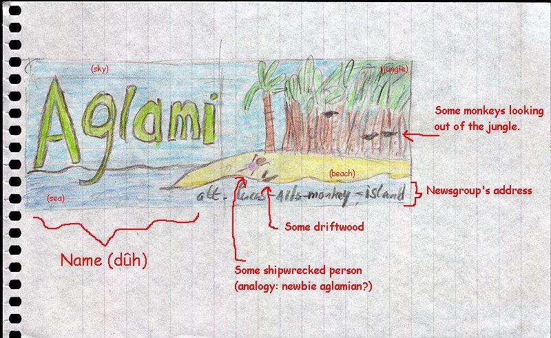
Something along the lines of this:
http://www.warande.net/~pixel/crap/aglami/topbanner01a.jpg

Only better... and fitting in nicely with Daffy's background ship thingy?
click on the images to view them
website by pixel (dűh)
lastest update on 10th december 2003


